Pffft ! Yeah, like, whatever… so, so thrilled.
"Meww" — A Comic For Kitties | Ep. #02 : The Button
The 2nd installment of “Meww”, a comicstrip For kitties.
The plot points and dialogue get a little intense — follow along… if you dare!
Once again, if you want the t-shirt, you can buy it now from my Redbubble store.
"Meww" — A Comic For Kitties
This is a special stupid project I’ve been messin’ with for a year — a comic strip intended only for cats & kitties, in a large-ish format usually seen in your Sunday newspaper comics section.
“meww!!”… heh-heh, do you get it? Of course not, dummy — you’re not a cat!
The dialogue is in feline — hence, only cats will get the humor, plot points, et al.
Humans: can you intuit what the two cats are blabbering about? Good luck if you can come up with a gag line better and funnier than “meww!!”
And, if you want the t-shirt, you can buy it now from my Redbubble store.
I’ll be adding new Meww comic strips to Redbubble — if you want to be updated when they’re available, blabber something down in the comments (either in human tongue or feline).
Slinky Kitty | A "What Was I Thinking?" Desk Drawer Project
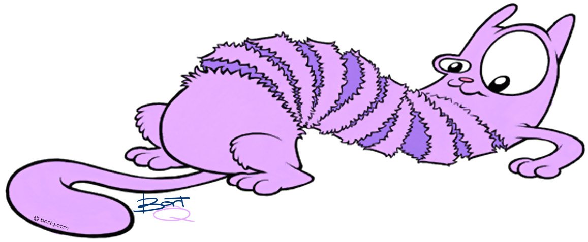
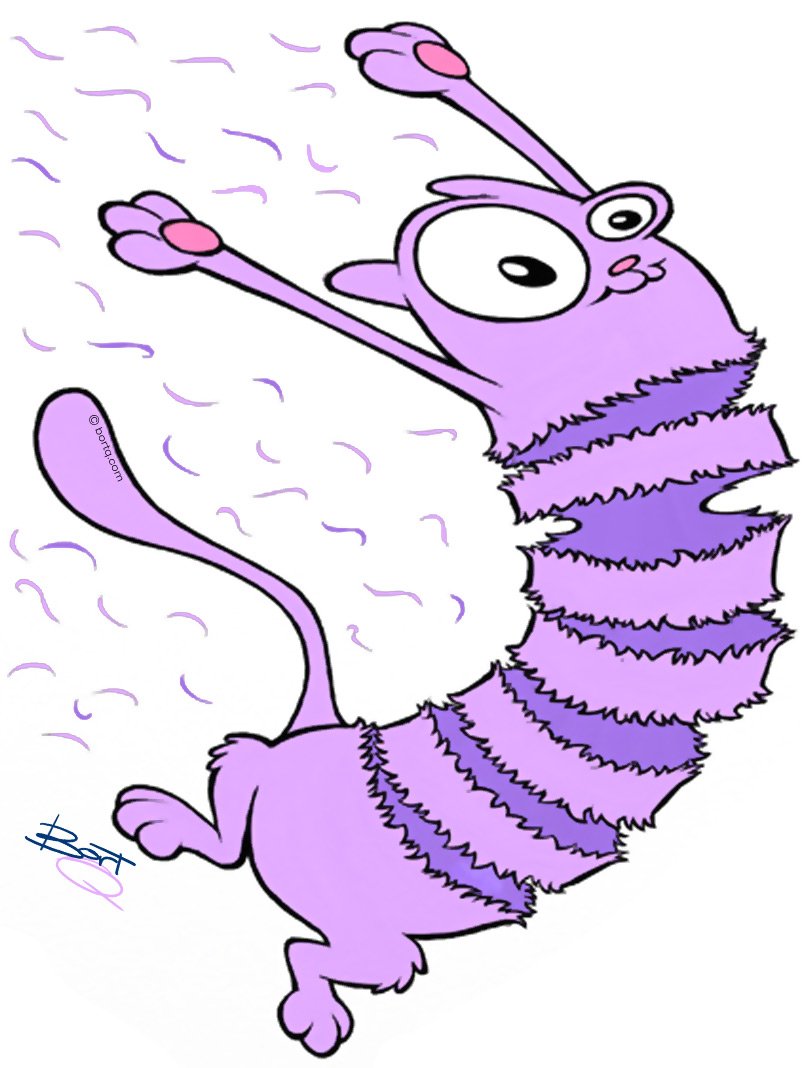
Fact: animals adapt.
That was the inspiration for “Floyd”, the cat that swallowed a slinky toy — general character development that went from artboard to being placed into the desk drawer for years.
At the time, my goal was to branch out into self-authored illustration/story books. Or, by some miracle, get hired as a go-to illustrator for a top-tier publishing house (or any tier).
A lacked time, money, motivation, and a myriad of reasons benched the whole thing.
Verdammt! Jetzt Geht Das Schon Wieder Los! | Another Mrs. Berry Birthday Doodle
Deutsches Kauderwelsch mit dem Wort "Geburtstag", das geschickt in diesen unsinnigen Haufen von Wörtern und Buchstaben und so weiter eingefügt wurde.
Es ist ein weiteres Geburtstagskritzel im deutschen Stil* für Nutley (N.J.)s Mutter Nr. 1.
(*Der zuvor erläuterte Insider-Witz ist hier zu sehen.)Hare-Brained Workplace Departure | Scribble-Dee-Doo-Dahs #072
“Mak” Makowoski (the bunny) announces he’s taking time off work to recoup … as there are no bridges to burn down, Mak throws a water balloon into the offices for good measure.)
A silly, little dumb doodle emailed to Workplace Proximity Associates as I take some annual leave.
That's Soooo Dumb! Incorporated | Scribble-Dee-Doo-Dahs #071
What do you do when you’re frustrated with EVERYTHING?
Your only option is scramble out of your hidey-hole, raise your bunny fist in the air and scream out loud:
Actual quote from my fellow workplace proximity associate.
Licensing-Induced Enthusiastic Depression Therapy | Scribble-Dee-Doo-Dahs #070
The mind goes to a dark place when you’re overwhelmed designing more & more Pokémon licensed product concepts.
A little doodle to help pass the time.
Death By Gummies | Scribble-Dee-Doo-Dahs #069
Inspiration was from a YouTube video showcasing funny signs.
Another W.P.A. Departure, Another Caricature | Caricature Corner 11
Work’s I.T. guy is retiring, so I had to doodle up a caricature.
Didn’t go the usual route by throwing in computers, floppy disks, et al… instead, I used the useless knowledge this person worships a football team, to wit, its mascot is a tiger.
Need I go on?
Christmas Season Hates Me! | Scribble-Dee-Doo-Dahs #068
I'm a "Man" Of Few Words (Even Less So) | Scribble-Dee-Doo-Dahs #066
This was quickly drawn up, replying to a rambling, long-winded, nonsensical work-related email inquiry.
"SUPER" Quick Caricature | Caricature Corner 10
A favor for a W.P.A.
The whole Superman™ thing was the W.P.A.’s idea (not certain the subject is a fan of the DC character or not); he likes to cook — with a lot of meat! — hence the Sirloin Knight in the background; loves his booze; and is a video gamer.
And below are the photo refs:
Kitty With Muffin Birthday Doodle
Another semi-super quick no-time-to-plan-out sketchy thing for a sister of a friend in NJ.
"Tower, This Is Ghost Rider Requesting A Slice-O-Cake" | Scribble-Dee-Doo-Dahs #065
Quick birthday doodle to my ex-Creative Manager and Top Gun aficionado, Dora.
Sidenote: I did a caricature of her in late 2020 along the same naval aviator theme - click here.
"I'm Grumpy Vader And I Approve This Message" | Stardate #001
A quick thumbs up! Grumpy Vader doodle after hearing the news my ol' Starlog magazine editor is gonna start up a new sci-fi/fantasy PRINTED magazine titled "Stardate."
It sounds like most-to-all past Starlog contributors will be onboard this new venture - this'll include cartoonists (yay!).
Estimated newsstand delivery date: late 2022.
In the meantime, to get back into sci-fi/fantasy headspace, I gotta catch up on all that has been going on in that genre — at the very least, glean whatever I can from the Google.
A Couple-O-Caricatures | Caricature Corner 09
With little time I have nowadays, it’s rare I can find a small corner of a weekend to scribble up a caricature or two.
Below are two examples of semi-rushed work of varied degrees of rushedness(?).
A wedding anniversary theme for my boss.
A somewhat rushed piece for an ex-W.P.A.
Project: Leggo My Eggo!
Once in a blue moon I get called up for a special one-of-a-kind project for Mitch Dowd, the apparel company I work for.
In 2018, when enthusiasm for the recent season 2 release of Stranger Things was at a record high, Mitch Dowd’s BossMan pegged me for a special project: push out an "eye-popping" Stranger Things retail-oriented proposal for Target.
This was a solo project from start to finish - no other "designers" contributed to the effort. And this is what I do best: left alone for a time to my own devices and getting deep into the weeds.
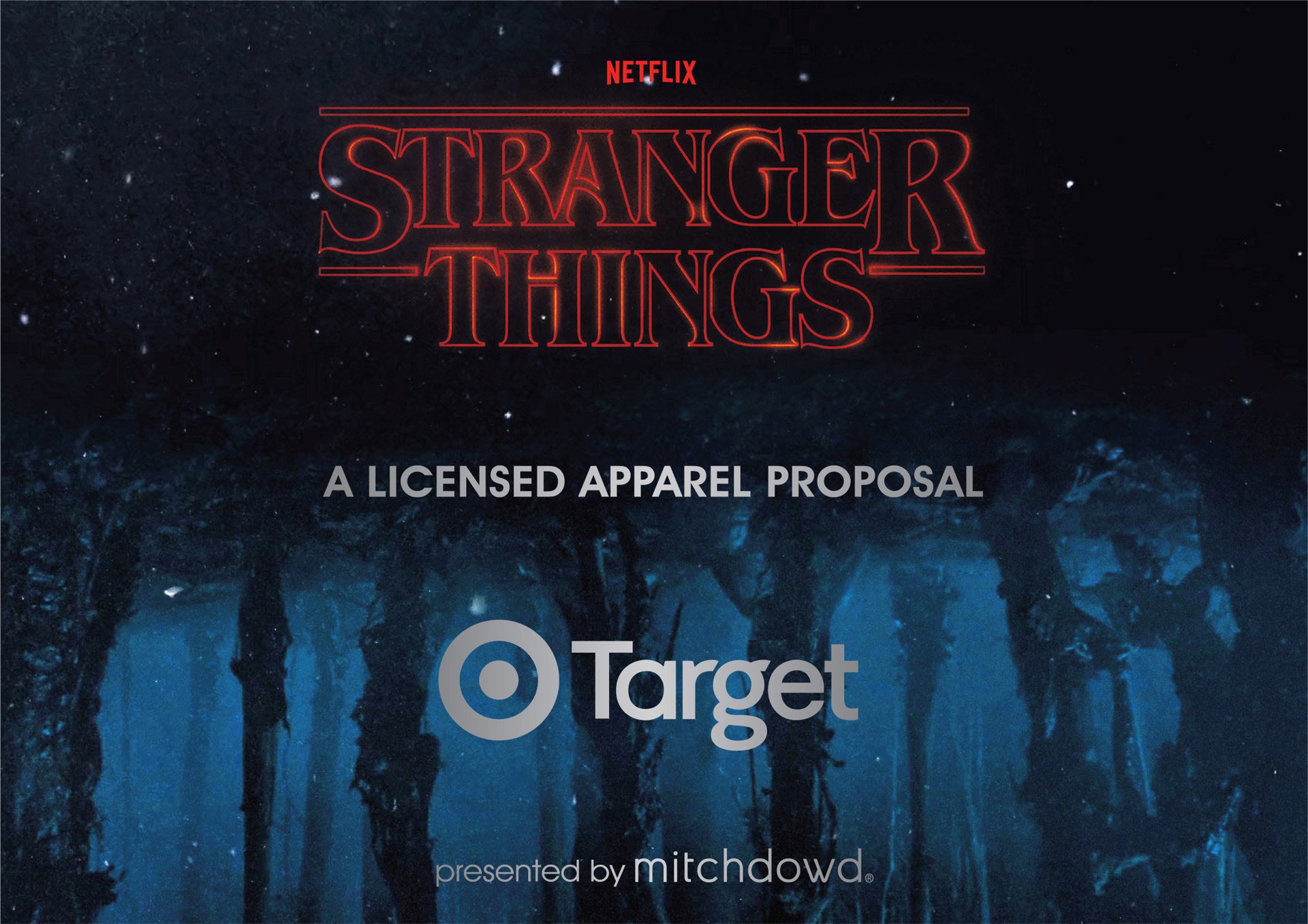
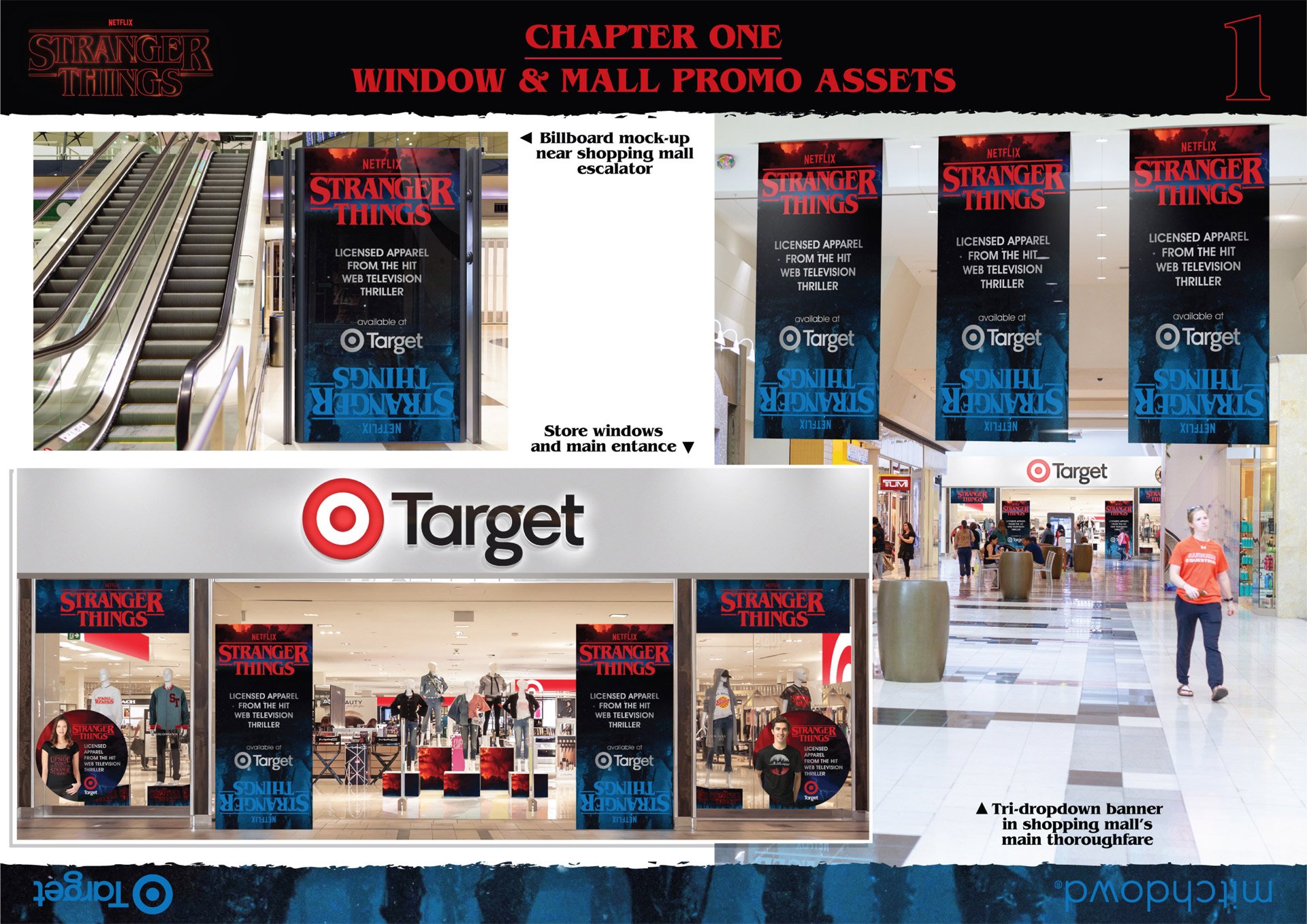
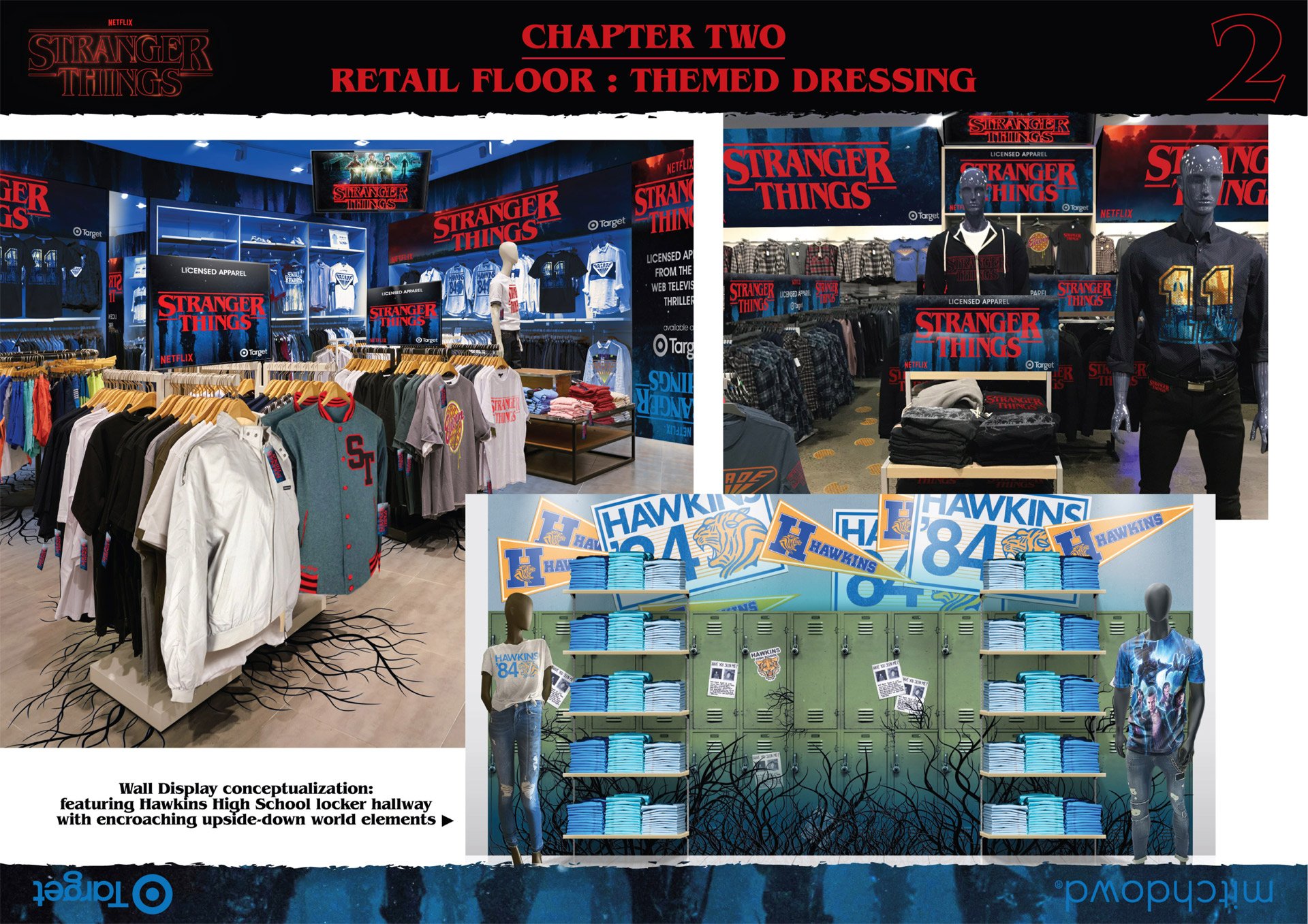
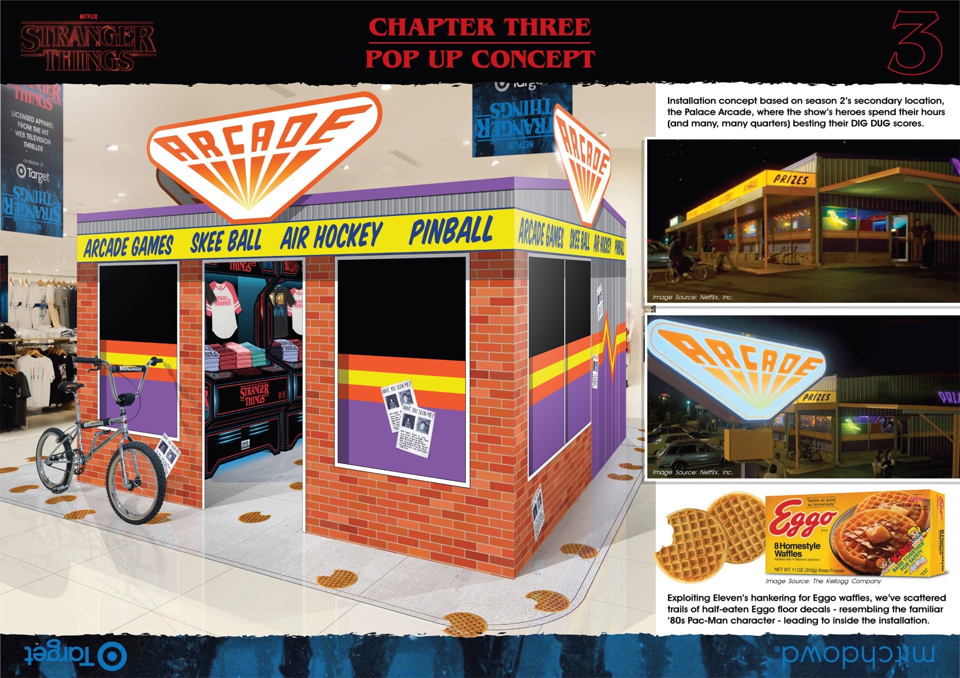
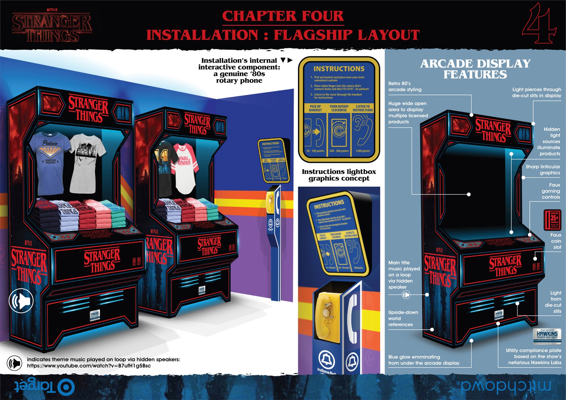
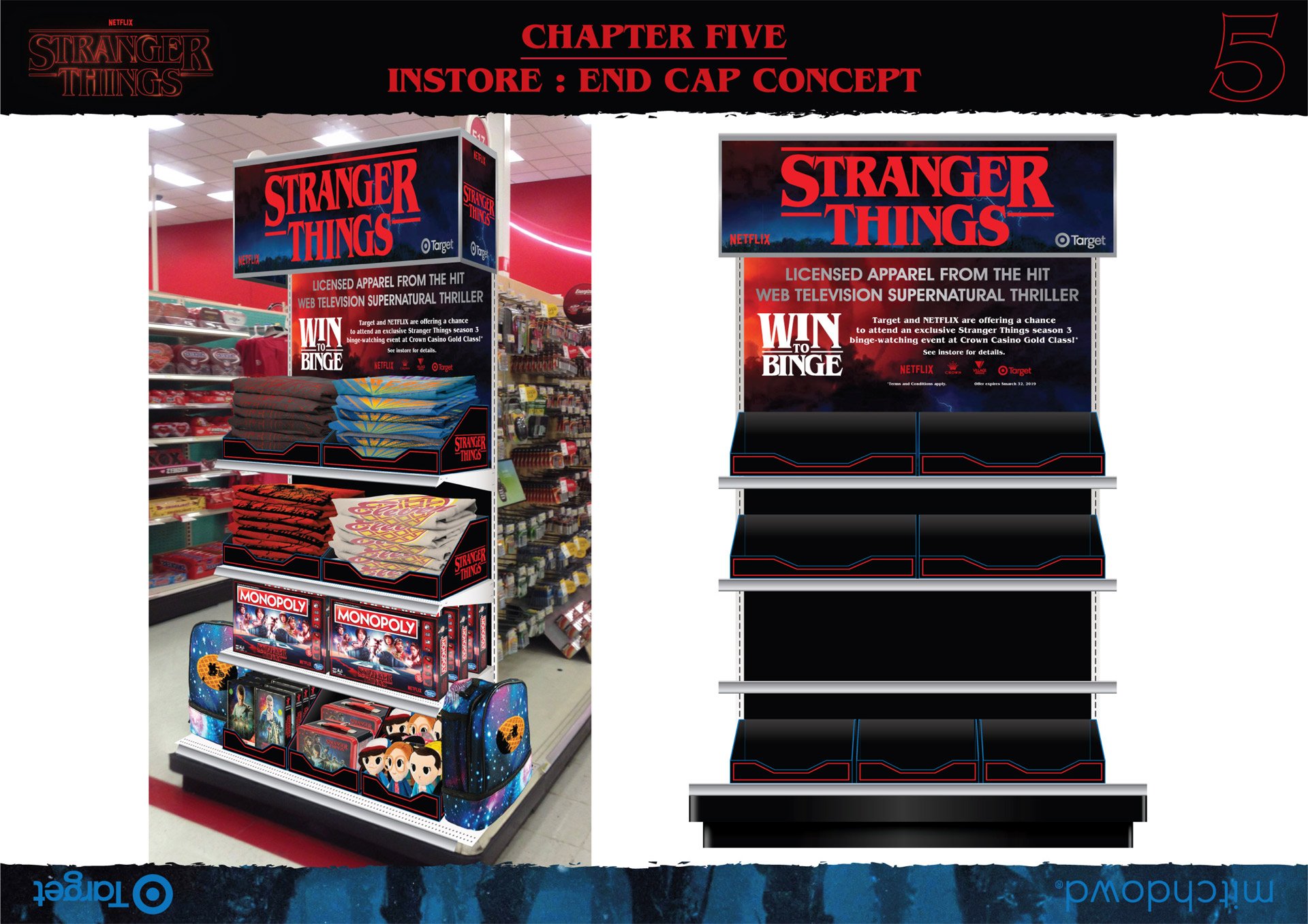
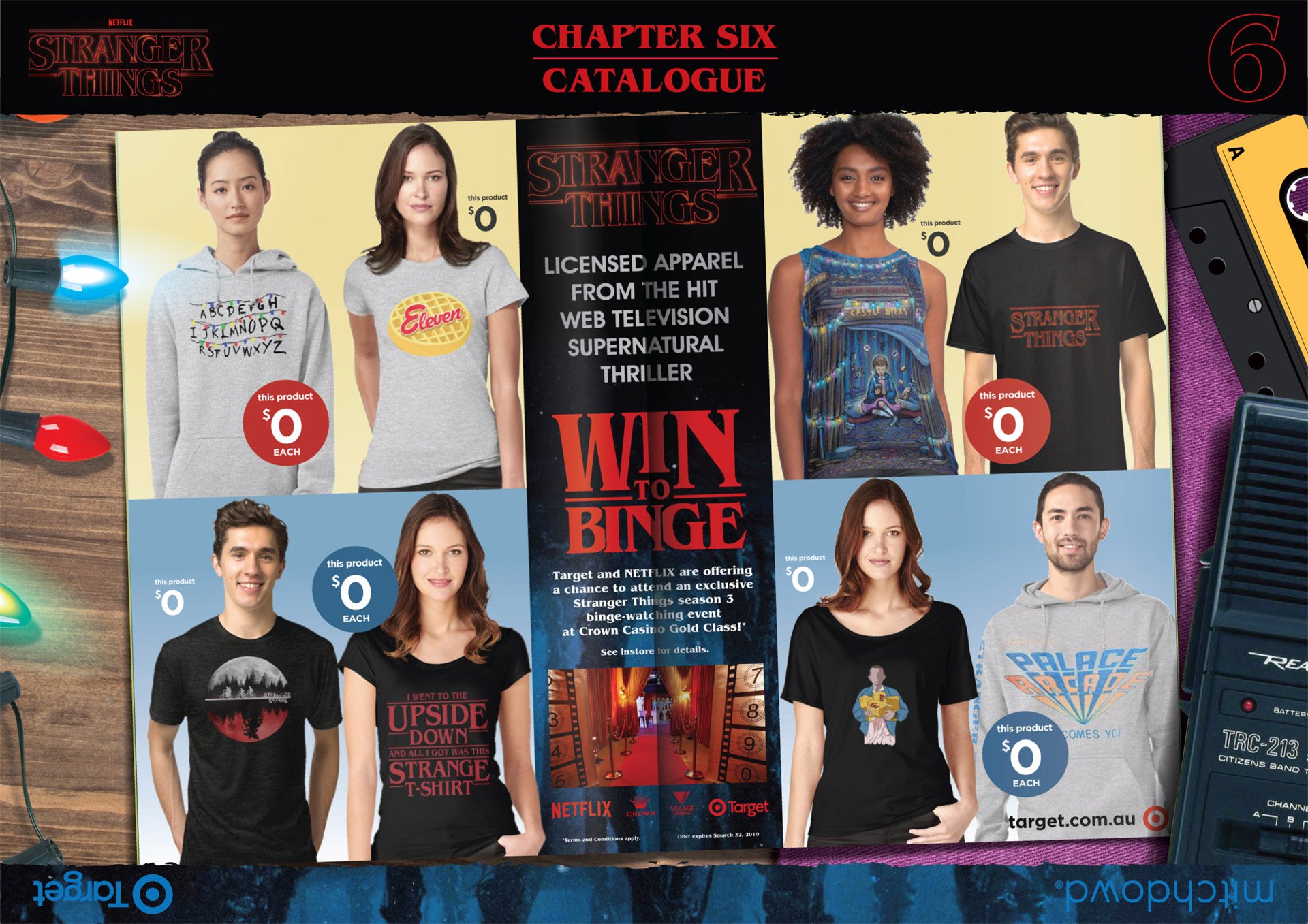
Started the project during work hours by essentially conceptualizing (roughly) on both sketchpad and on screen. Then, over a full weekend, I dug into the subject matter, pulling reference material from both official and fan-based web sources - no style guide available to pluck assets or ideas from.
To get into the mood further, I found a 10+ hour track of the Stranger Things theme music on a loop on YouTube and had it playing in the background… the original youtube mood music link, seen on page 5 of the proposal, has long since been deleted.
Presentation for each page of the proposal was treated as if they were episodes, or "chapters", of the show — note the font treatments on the page headers, call-outs and text content.
I knew from the beginning, real-world execution of most-to-all concepts created for the proposal would not have been cost effective to properly design, construct and install in a department store setting. AND be completely unrealistic for a single department store to dedicate valuable floor space to only one license with, at the time, a limited market appeal — it's now 2022 and Stranger Things’ appeal has greatly broadened since then.
Some concept imagery from the proposal can already be seen here.
The whole point of this exercise: get the foot in the door. If Mitch Dowd could secure a bare minimum of Stranger Things apparel orders, then this whole exercise would’ve been worth it.
In the end, the proposal was repackaged for another local retailer (Big W) starting a wave of interest and eventually ORDERS! More retail chains have gotten onboard in the last 2 years.
The payoff for Mitch Dowd continues to this day. I'm just content to be a part of that venture from the very beginning - I only wish I could do more special projects like this: they're challenging, creatively intensive, but darn satisfying in the end (it would certainly get me out of designing men’s apparel day after day!).
Everybody Needs A Birthday Donut | Scribble-Dee-Doo-Dahs #064
Yet another spare-of-the-moment, and unsolicited, donut-themed birthday illo I posted on voice talent extraordinaire Jim Cutler’s facebook page.
What We Have Here Is A Total Lack Of Respect For The Law! | Caricature Corner 08
The latest in a line of caricature requests from my WPAs (Work Proximity Associates), this time with a distinct Smokey And The Bandit vibe.
And, yes, this father (reference photo below) and kids are haulin' a trunk full of bootlegged Coors beer in his most-beloved Fiat coupe across state lines, with a dusty column of law enforcement posse with Sheriff Buford T. Justice in the vanguard.
Update: And, of course, the client wanted another option - replacing the Sheriff and posse with a lighthouse and a winding road.
The new scenery is supposed to be Aireys Inlet, complete with sea captain-manned lighthouse, hence the pirate parlance signage reading “YARRRreys Inlet”.


